With UX/UI design with Figma at the forefront, designers are equipped with a powerful tool that shapes the way users interact with digital products. Figma stands out not just for its design capabilities but also for its collaborative features that allow teams to work seamlessly together, regardless of their location. This article delves into the fundamentals of UX/UI design principles, the tools and features of Figma, and effective web design strategies that enhance user experience.
Understanding user needs is the backbone of effective design, and Figma offers unique tools that bring these insights to life. From prototyping interactive designs to leveraging plugins for a more efficient workflow, Figma enables designers to create impactful, user-centered interfaces. This exploration will provide a comprehensive overview of how to implement best practices in responsive web design and guide you through the process of creating a visually engaging landing page.
UX/UI Design Fundamentals
Understanding the fundamentals of UX/UI design is critical for creating interfaces that not only look good but also provide an exceptional user experience. This involves a deep comprehension of user needs, behaviors, and the environment in which they interact with the product. By adhering to core principles, designers can create more intuitive and engaging interfaces that resonate with users.The principles of UX/UI design include usability, accessibility, consistency, and visual hierarchy, among others.
Usability ensures that users can navigate interfaces easily and accomplish their tasks without confusion. Accessibility focuses on making designs usable for individuals with diverse abilities. Consistency across the interface aids users in understanding how to interact with various components, while visual hierarchy guides users’ attention through well-structured layouts that emphasize the most important elements.
User Research in Design Decisions
User research plays a pivotal role in shaping design decisions and enhancing user experience. It involves gathering insights about users’ needs, preferences, and behaviors through various methods, such as surveys, interviews, and usability testing. This information provides designers with a clearer understanding of the target audience, allowing for more informed and effective design choices.Incorporating user research leads to more user-centered designs, reducing the risk of assumptions that may not align with actual user needs.
For instance, conducting usability tests on a prototype can reveal pain points in navigation, prompting designers to make adjustments before the final product launch. The insights gained can significantly improve overall satisfaction and usability.
Common UX/UI Design Patterns in Figma
Design patterns are reusable solutions to common design problems, providing a guideline for creating intuitive interfaces. Figma, as a robust design tool, supports these patterns, making it easier for designers to implement them effectively. Below are some common UX/UI design patterns and their applications in Figma:
- Navigation Bars: Essential for helping users find their way through an interface. Figma allows for easy creation of responsive navigation bars that adapt to various screen sizes.
- Cards: Cards are versatile components that can display a variety of information. They can be used in Figma to showcase products, articles, or user profiles, presenting data in an organized manner.
- Modal Windows: These are overlays that focus user attention on a specific task. In Figma, designers can prototype modals that provide important information or require user actions without navigating away from the main interface.
- Forms: Forms are critical for gathering user input. Figma’s interactive components can help design effective forms that enhance user engagement and streamline data collection.
Utilizing these patterns not only accelerates the design process but also ensures that interfaces are familiar to users, thereby improving their overall experience. Each design pattern serves a specific purpose and can be easily adapted to fit various projects within Figma.
Figma Tools and Features

Figma is a powerful design tool that emphasizes collaboration and efficiency, making it a go-to choice for UX/UI designers. Its cloud-based platform allows teams to work together seamlessly, no matter where they are located. Let’s dive into the tools and features that make Figma an essential part of the design workflow.
Collaborative Design Tools
Figma provides several tools that enhance collaborative efforts among team members. These features are designed to facilitate real-time feedback and streamline the design process. The following tools are key to achieving effective collaboration:
- Real-time Collaboration: Multiple users can edit a design simultaneously, allowing for instant updates and feedback.
- Commenting System: Team members can leave comments directly on the design, which helps in addressing feedback without needing external communication tools.
- Version History: Figma maintains a comprehensive version history, enabling designers to track changes and revert to previous versions if necessary.
- Design System Integration: Shared libraries enable teams to maintain consistency across designs by using the same components and styles.
Prototyping Features
Figma’s prototyping capabilities allow designers to create interactive and engaging experiences. By utilizing these features, designers can simulate user flows and test interactions before development. Key aspects of Figma’s prototyping include:
- Interactive Components: Designers can create components that respond to user actions, like hover or click, enhancing the user experience.
- Smart Animate: This feature allows for smooth transitions between frames, making prototypes more visually appealing and realistic.
- Linking Frames: Designers can create navigation flows by linking different frames, enabling viewers to click through the prototype just like a live app.
- User Testing: Prototypes can be shared with stakeholders for testing, gathering valuable feedback before finalizing the design.
Enhancing Workflows with Plugins
Figma’s extensive library of plugins enhances design workflows by providing additional functionalities that streamline repetitive tasks. Utilizing these plugins can significantly improve efficiency in the design process. Some beneficial plugins include:
- Content Reel: This plugin helps designers quickly insert placeholder text, images, and icons, saving time on manual entry.
- Figmotion: For those looking to add animations, Figmotion allows designers to create animations directly within Figma.
- Unsplash: This plugin provides access to a vast library of high-quality images that can be easily inserted into designs.
- Design Lint: A tool for identifying and fixing inconsistencies in designs, helping maintain a clean and polished final product.
Web Design Strategies
In the digital landscape, effective web design strategies are crucial for creating engaging and user-friendly experiences. These strategies not only enhance the visual appeal of a website but also improve functionality and accessibility. In this section, we will explore key practices in responsive web design, layout techniques, and a practical guide to designing a landing page using Figma.
Best Practices for Responsive Web Design
Responsive web design ensures that a website performs well on a variety of devices and screen sizes. This practice is essential as more users access the web via mobile devices. Here are best practices to implement responsive design using Figma:
- Fluid Grid Layout: Design layouts based on a flexible grid that adjusts to screen size. Figma’s layout grids feature allows you to set up grids that scale proportionally with the screen.
- Flexible Images: Use scalable vector graphics (SVG) and responsive images. In Figma, you can set images to scale with their containers, ensuring they maintain quality across devices.
- Media Queries: Implement media queries to apply different styles for various screen sizes. While Figma doesn’t code, designing multiple artboards for different breakpoints can help visualize the final outcome.
- Touch-Friendly Elements: Ensure buttons and links are adequately sized for touch interactions. Utilize Figma’s prototyping features to test the usability of elements on various devices.
Comparison of Layout Techniques for Web Design
Different layout techniques can significantly impact user engagement and interaction. Understanding how these techniques affect user behavior is vital for designers. Let’s compare some common layout techniques:
- Grid Layout: Provides a structured and predictable way for users to navigate content. This layout can lead to increased comprehension and engagement as users find information easily.
- Asymmetrical Layout: Offers a more dynamic, visually interesting experience. While it can capture attention, it risks overwhelming users if not balanced correctly.
- Single Column Layout: Perfect for mobile devices, this layout simplifies navigation and focuses user attention. It is effective for storytelling and linear content.
- Card Layout: Organizes content into bite-sized pieces, making it digestible and visually appealing. Popular in social media and e-commerce, this layout enhances user interaction.
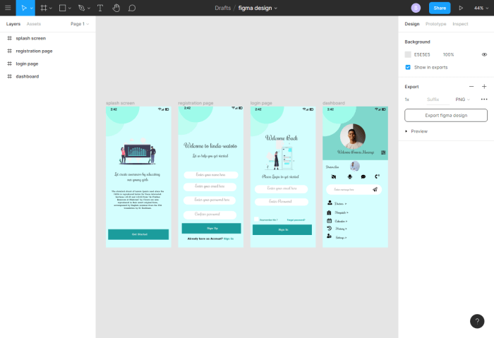
Step-by-Step Guide on Designing a Landing Page in Figma
Designing a landing page requires a thoughtful approach to both UX and UI principles. Below is a step-by-step guide to create an effective landing page in Figma:
- Define Your Goal: Establish the primary objective of your landing page, such as lead generation or product promotion.
- Create a Wireframe: Start with low-fidelity wireframes to map out the layout and flow of content, focusing on user experience.
- Select a Color Palette: Choose colors that align with your brand and evoke the desired emotional response. Figma’s color styles can help maintain consistency.
- Add Typography: Use font styles that enhance readability and align with your brand identity. Utilize Figma’s text styles for consistency across your design.
- Incorporate Visual Elements: Use images, icons, and graphics that support your message. Ensure they are optimized for fast loading times.
- Design Calls-to-Action (CTAs): Create prominent CTAs that encourage user interaction. Use contrasting colors and strategic placement to draw attention.
- Prototype and Test: Use Figma’s prototyping features to create interactive versions of your design. Gather feedback through user testing to refine your design further.
Summary
In summary, mastering UX/UI design with Figma opens up a world of possibilities for designers aiming to create intuitive and engaging digital experiences. By integrating the principles of effective design, utilizing the collaborative features of Figma, and following structured web design strategies, you’re well on your way to crafting interfaces that resonate with users. So, dive in, experiment with Figma, and let your creativity flourish as you redefine the digital landscape.
FAQ Guide
What is Figma used for in UX/UI design?
Figma is used as a collaborative design tool that allows designers to create, prototype, and share user interface designs in real-time.
Is Figma suitable for beginners?
Yes, Figma is user-friendly and offers extensive resources, making it accessible for beginners while still powerful for experienced designers.
Can Figma be used for mobile app design?
Absolutely, Figma can be used to design interfaces for mobile apps, supporting both responsive web and mobile design practices.
How does Figma facilitate team collaboration?
Figma allows multiple users to work on the same file simultaneously, providing real-time feedback and updates, which enhances team collaboration.
What are Figma plugins, and how do they help?
Figma plugins are third-party tools that extend Figma’s functionality, helping designers streamline workflows, automate tasks, and enhance their design capabilities.


